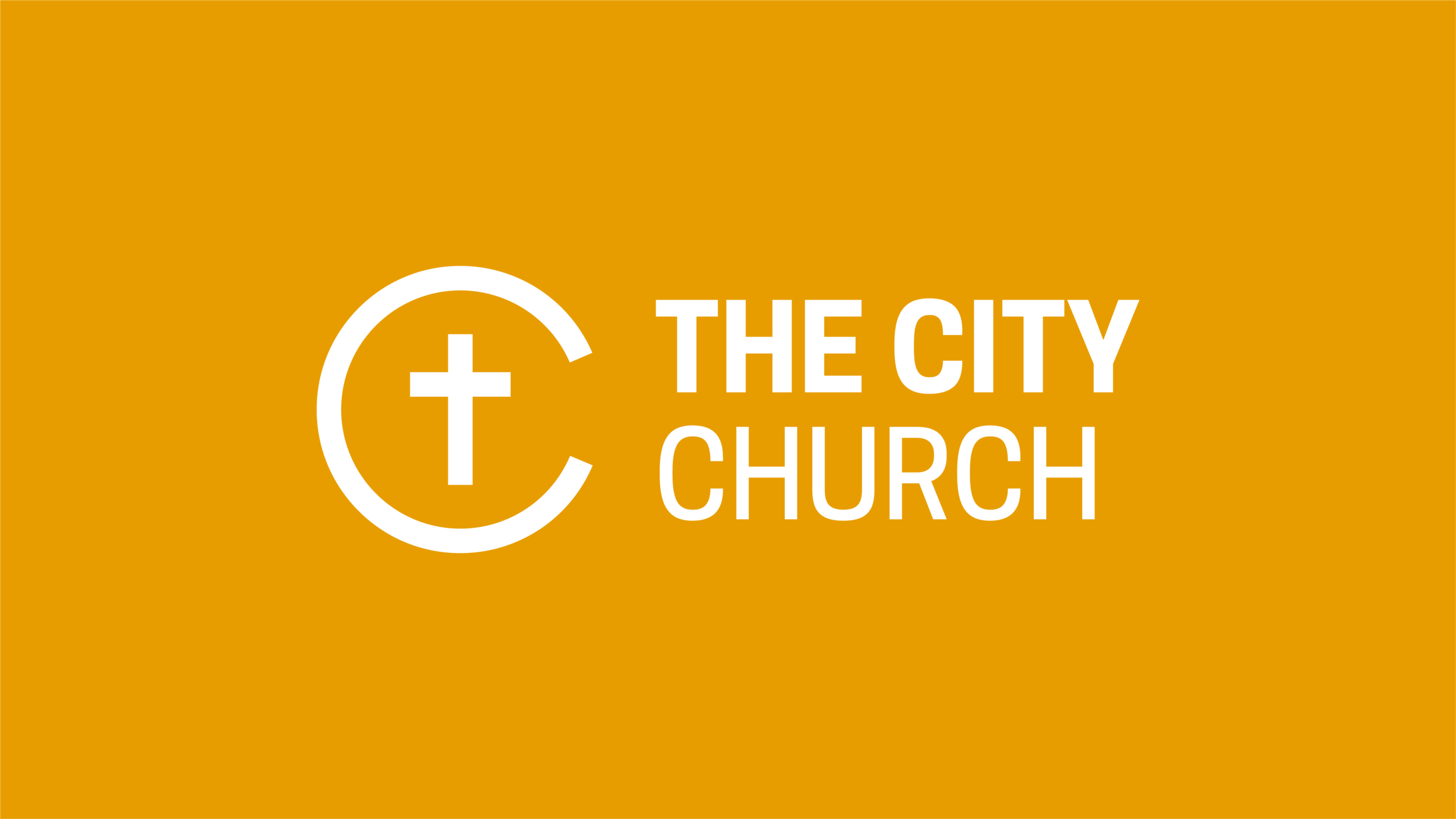
THE NEW LOGO
You may have noticed recently a new church logo being used in various places. For those who are interested in why the new logo was made, here is a brief explanation.
WHY A NEW LOGO?
There were two primary reasons for why we re-designed The City Church logo:
To emphasise the purpose of why we exist as a church in the first place
To bring it up to date with the rest of the visuals we produce as a church
1. WHY WE EXIST
The previous logo served us well for a number of years, visually communicating that we are a community of diverse people.
We love that our church is a diverse one - it's one of our values (see value 3), and our vision statement is that we are 'Inviting everyone to encounter Jesus'.
The purpose of the new logo isn't to deny this important part of our identity, but rather to emphasise that it is the cross of Christ that lies at the foundation of our communal identity.
Putting the cross at the centre of our logo is an intentional statement, as it's a symbol that is recognisable to churchgoers and non-churchgoers alike. It is a plain and simple visual cue, saying that we are a church that exists to proclaim the crucified saviour, and we're unashamed of that.
2. VISUAL STYLE
Over the last couple of years, we started a journey of changing the visual style of things we produced as a church.
We moved from a style that started to feel 'corporate' into one that is more 'familial', embracing bright colours and simplicity. From a design and branding perspective, it was time to update the logo.
So keep your eyes peeled as the new logo gets rolled out everywhere - and if you see an old logo hanging around anywhere, then please send an email to ryan.hunt@thecitychurch.org.uk so that we can get it changed!